Have you noticed Google Search looking slightly different lately, even when you’re not looking at a major algorithm update? That’s because Google keeps experimenting with how search results and ads are presented, especially on smaller screens.
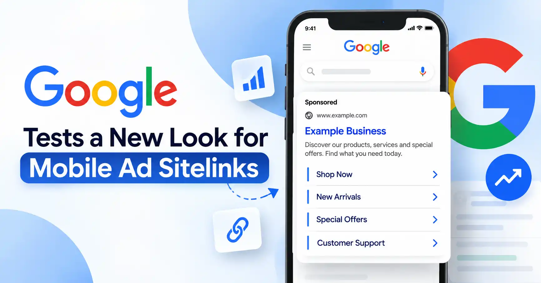
The latest example is a new test involving mobile ad sitelinks. Google appears to be trying different ways of displaying the extra links that sit underneath search ads, including darker text, a left side visual margin and arrows beside individual links. Other variations have also been spotted, including blue sitelinks and versions that use images.
It might sound like a small design tweak. For advertisers, though, the way a search ad occupies the screen can affect how easily people notice and interact with different parts of the ad.
So, what exactly is Google testing, and should advertisers change anything?
What is Google changing with mobile ad sitelinks?
The latest Google Ads sitelinks test changes the visual treatment of links that appear underneath a sponsored search result.
Instead of looking like a compact group of traditional links, the tested version presents sitelinks more like a vertically organized list. The links use darker text, appear alongside a margin or line on the left, and include arrows that visually signal that each option can be opened.
Brodie Clark, who tracks changes across Google’s search results, reported that the September 2026 test included this darker text treatment and that other variations had also been observed, including blue sitelinks and sitelinks accompanied by images.
That last part is particularly interesting.
Google has already experimented with richer sitelink extensions, including image based treatments earlier in 2026. So this doesn’t look like one isolated experiment. It fits into a broader pattern of Google testing how much information and interaction can be packed into search ads.
For now, though, it’s still a test. There’s no indication that this exact design has become the standard mobile format.
Why do mobile ad sitelinks matter more than they seem?
Think about how you use Google on your phone.
You search for a product, service or company and get a sponsored result. The main headline might answer your initial question, but the sitelinks can give you shortcuts to other useful pages.
For example, a software company could show:
- Pricing
- Features
- Free Trial
- Customer Reviews
A retailer might use:
- New Arrivals
- Men’s Clothing
- Women’s Clothing
- Sale
Instead of forcing someone to land on the homepage and hunt around, the sitelink lets them jump directly to a relevant destination.
That’s the basic purpose of Google Ads assets. Google says sitelinks can send people directly to specific pages on a website, while additional assets can make ads more useful and prominent on the search results page.
The mobile experience makes this even more important because screen space is limited. A small visual change can alter how quickly someone understands the available choices.
Is this a new Google Ads feature advertisers can control?
Not exactly.
This is probably the most important point to understand.
The new appearance is being tested by Google. Advertisers don’t appear to have a new setting inside Google Ads that lets them switch on the darker text, arrows or image based design.
In other words, don’t waste an afternoon looking through your campaign settings for a “new mobile sitelink layout” button.
What advertisers can control is the underlying Google Ads assets.
You can create relevant sitelinks, write concise link text, add appropriate descriptions and send users to useful landing pages. Google then decides which eligible assets appear and how they are presented.
Google’s current guidance recommends creating multiple relevant sitelinks. It also says short link text helps more links fit, while descriptions can provide additional useful information.
The design may change. The fundamentals don’t.
What can advertisers learn from Google’s mobile search ads test?
There are a few practical lessons here.
1. Treat every sitelink as a useful destination
Don’t add sitelinks simply because Google gives you the option.
If your main ad promotes a service, each sitelink should take users somewhere genuinely useful. A “Pricing” link should lead to pricing. A “Contact Us” link should make contacting the business easy.
Simple, yes. Surprisingly often ignored, also yes.
2. Write sitelink text for small screens
Mobile users don’t want to decode clever navigation labels.
Short and descriptive usually works better.
Instead of something vague like “Explore More,” use something specific such as “View Pricing” or “Book a Demo.”
Google currently limits sitelink text to 25 characters in most languages, making concise copy especially important.
3. Don’t build your strategy around one visual format
Google has tested mobile sitelinks in several different styles over time.
Earlier experiments included carousel style presentations, dotted underlines and image enhanced sitelinks. The latest test adds another visual variation.
That means advertisers should focus less on predicting Google’s next design and more on making their assets useful regardless of the presentation.
4. Watch mobile performance separately
If your campaigns receive substantial mobile traffic, keep an eye on mobile specific performance.
Look beyond overall CTR.
Check:
- Sitelink clicks
- Conversion rate
- Cost per conversion
- Landing page performance
- Mobile versus desktop results
- Which sitelinks receive the most engagement
A layout change doesn’t automatically mean performance will improve. There isn’t enough public evidence yet to claim that this particular September 2026 test increases CTR or conversions.
That distinction matters.
Could the new sitelink design affect CTR?
Possibly, but it’s too early to say.
A more visible sitelink could make additional destinations easier to discover. Arrows may make the links feel more obviously clickable. A vertical layout could also make individual options easier to scan.
But those are reasonable hypotheses, not proven results from this experiment.
Google hasn’t published performance data showing that the new darker mobile sitelink treatment produces a specific CTR or conversion improvement.
Advertisers should therefore resist the temptation to look at a screenshot and declare, “This will increase conversions.”
Search interfaces are full of little visual experiments. Some stay, some disappear, and some evolve into something completely different.
The smarter approach is to watch what actually happens in your account.
What should advertisers do right now?
The good news is that there’s no need for a major campaign overhaul.
Start with a simple Google Ads sitelinks audit.
Check whether your most important campaigns have enough relevant sitelinks. Review the link text and make sure each one points to a useful, mobile friendly page.
Then look at your reporting.
Are people clicking your pricing page more often than your features page? Is one sitelink generating conversions while another gets plenty of clicks but little business value?
Those insights are more actionable than worrying about whether Google ultimately keeps the new arrow design.
It’s also worth reviewing your broader PPC strategy for 2027 and seeing how sitelinks fit alongside automation, conversion data and other paid search changes.
For advertisers already investing heavily in mobile search, this is another reminder that the ad itself isn’t just the headline and description. The supporting assets increasingly form part of the experience.
What does Google’s latest mobile ad test mean for PPC?
The bigger story isn’t really the darker text or the arrows.
It’s Google’s continued experimentation with how sponsored results work on mobile.
Over the past several months, Google has tested different treatments for mobile ad sitelinks, including dotted underlines, images and other ways of presenting additional links. The latest test continues that pattern.
For advertisers, the practical takeaway is straightforward: build strong assets, make every destination useful, keep mobile landing pages fast and relevant, and measure what users actually do.
Google can change the wrapper around your ad. You still control much of what’s inside it.
And if this latest sitelink design does roll out more broadly, advertisers with clean, relevant assets will already be in a better position to take advantage of the additional screen real estate.
FAQ’s
Mobile ad sitelinks are extra clickable shortcuts on phone search ads. Why dump visitors on the generic homepage when you can rocket them straight to the exact page they crave?
Not yet. Google’s testing the September 2026 layout right now. They constantly tinker with search and ad setups, meaning this experiment might shift or just vanish entirely.
There is currently no advertiser setting specifically for the darker text, arrows or left side layout. Advertisers control the sitelink assets themselves, while Google determines how eligible assets are displayed.
Google recommends adding multiple relevant sitelinks rather than relying on only one or two. The number displayed can vary depending on the campaign, device and available space.
Sitelinks can give users more direct paths to relevant pages and can make ads more useful and prominent. However, performance varies by campaign, and the latest visual test should not be assumed to improve CTR or conversions until actual data supports that conclusion.
Conclusion
Google testing a tiny mobile ad sitelink tweak might seem minor, but it tells PPC pros a lot. Search ads keep shifting.
Don’t chase every single visual test that drops, Keep your sitelinks tight, relevant, and tied to solid mobile landing pages instead. Let the raw campaign numbers show you what pulls weight and what doesn’t.

Kumar Swamy is the CEO of Itech Manthra Pvt Ltd and a dedicated Article Writer and SEO Specialist. With a wealth of experience in crafting high-quality content, he focuses on technology, business, and current events, ensuring that readers receive timely and relevant insights.
As a technical SEO expert, Kumar Swamy employs effective strategies to optimize websites for search engines, boosting visibility and performance. Passionate about sharing knowledge, he aims to empower audiences with informative and engaging articles.
Connect with Kumar Swamy to explore the evolving landscape of content creation!