Your hero section is your website’s first handshake. Not the type that will crush your knuckles, laughing while enjoying your pain, but rather the gracious kind that says, “Give your feet up and enjoy; you’re in the right place and speaking my language.” From over the fold, you have that one tiny window to earn attention, communicate value, and lead to the next click. Hear all the heavy lifting from your headline. Subhead is clarification. Call-to-Action is carry sideways direction. The beautiful hero image diffuses the very page’s emotional temperature.
With the right image, everything falls in place. With the wrong image, even great copy makes you wonder if you’re hearing the script being read. The challenge is that “hero image” doesn’t mean “pretty picture.” Native advertising feels more relevant when the featured product is in harmony with the aesthetics of the surrounding website.
This is a practical guide to choosing stock photography for hero sections that actually convert, not just decorate.
What Makes a Hero Image “Convert”?
Conversion is an act – a click of a button, filling out a form, starting a trial, buying a product, booking a call. Your hero image is not everything but it can either amplify clarity or muddy it.
A converting hero image typically does at least one of these jobs:
- Clarifies what you offer at a glance
- Shows the outcome your customer wants (before-and-after energy)
- Builds trust by feeling realistic, professional, and aligned
- Creates desire by visualizing a better state
- Guides attention toward the headline and CTA
- Reduces uncertainty by providing context or proof
If there’s none, this is usually for visuals, and perhaps this hero image is wallpapering your page. While wallpaper can look nice, it’s anything but persuasive.
Start With the Message, Not the Image
- The commonmost mistake that the heroes make is choosing an image and then forcing the copy in, just like that-a frame is bought, and an artwork is sought that fits the feeling of the frame. Rather, define your hero message in one sentence:
- Who is this for?
- What do you help them do?
- What’s the primary benefit?
- What’s the next action you want them to take?
Example: “Project management software that keeps small teams aligned without meetings.”
Now your image selection becomes easier. You’re not searching for “business people.” You’re searching for “small team alignment, calm productivity, modern tools, clarity.”
If you can’t summarize your hero message, your image can’t rescue you. It’ll just distract people while they remain confused.
Choose the Right Type of Hero Image for Your Offer
Every business should not have the same style of hero image. Choose the theme that would go best with the product or service.
1) Product-in-context (best for physical products)
Show the product being used in a real environment. This reduces uncertainty and helps visitors instantly understand the use case. A skincare bottle in a bathroom with morning light. A kitchen tool mid-action. A backpack on someone’s shoulders in the wild.
Key traits:
- Natural lighting and believable settings
- Hands or people using the product (when appropriate)
- Clean composition with room for text
2) Outcome-led lifestyle (best for brands selling transformation)
Instead of showing the “thing,” show the emotional result. Calm confidence. Freedom. Health. Adventure. Comfort. This works especially well for services, coaching, travel, wellness, and lifestyle ecommerce.
Key traits:
- Authentic expressions and relatable situations
- A clear mood aligned with the brand
- Avoid “generic happiness” without context
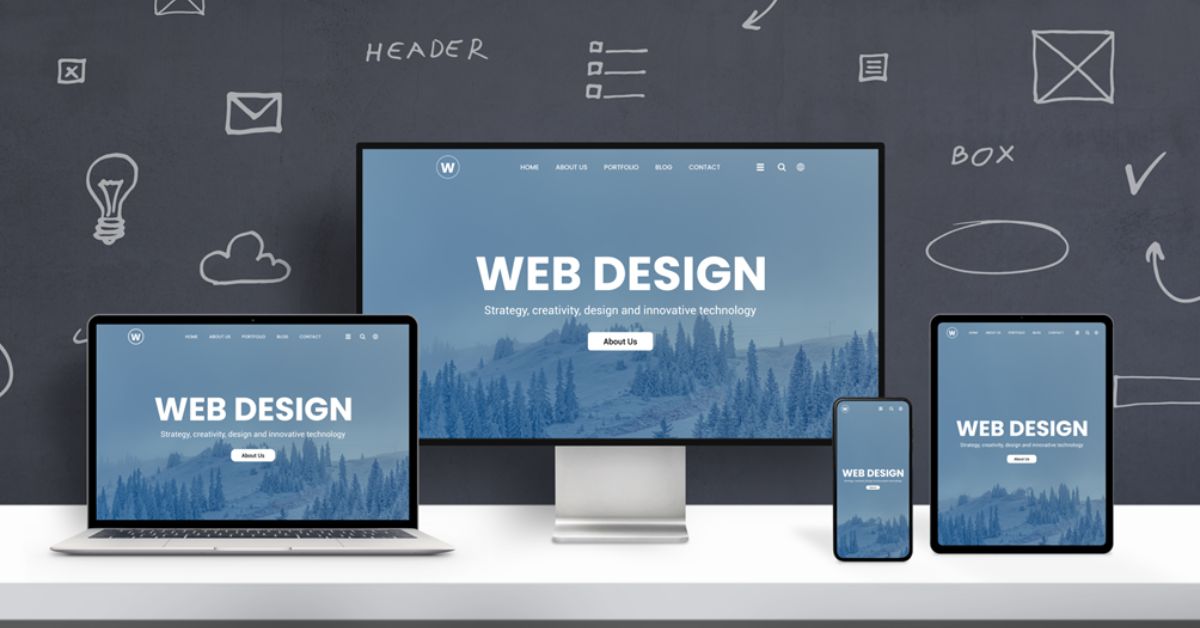
3) UI or dashboard with supporting imagery (best for SaaS)
For software, clarity often improves when visitors can see the interface. Combine a product screenshot with a complementary photo or subtle illustration.
Key traits:
- Screenshot should be readable and purposeful
- Supporting imagery should not compete with UI
- Keep the color palette unified
4) Conceptual metaphor (best for abstract services)
If you sell something intangible, a metaphor can work, but it must be relevant and not confusing. Think “signal vs. noise” for analytics, “pathway” for guidance, “craftsmanship” for premium service.
Key traits:
- Minimal, clean, instantly understandable
- Avoid cliché metaphors that scream “template site”
- Must still leave room for headline legibility
The Three-Layer Conversion Test
Before you commit to a hero image, run it through this quick test:
- Clarity layer: Does the image help me understand the page faster?
- Emotion layer: Does it make me feel the right thing for this brand?
- Action layer: Does it naturally support the CTA, or distract from it?
If you only pass the emotion layer (“it’s pretty”), you’re not done.
Composition Rules That Matter Above the Fold
Hero images live in a crowded neighborhood. They must cooperate with text, buttons, nav bars, and responsive breakpoints. The right image makes layout easier. The wrong one turns your designer into a reluctant magician.
Look for these composition features:
Negative space for text
You want areas of calm where text can sit without looking like a ransom note taped to a busy scene. Skies, blank walls, blurred backgrounds, simple gradients, or large out-of-focus regions are your friends.
You want areas of calm where text can sit without looking like a ransom note taped to a busy scene. Skies, blank walls, and blurred backgrounds are your friends. This visual clarity is a core part of a broader strategy to improve site speed and user experience, ensuring that once you capture a visitor’s attention with a great image, the page performance keeps them there.
Clear focal point
Even with text overlay, the image should have a focal point that reads quickly. Avoid scenes with too many competing subjects, especially for mobile.
Directional cues
People’s eyes and body orientation guide attention. If the subject is looking toward the headline/CTA, it subtly pulls the visitor’s gaze there too. If they’re looking off-screen toward nowhere, you’ve created an attention leak.
Cropping flexibility
A hero image will be cropped differently across desktop, tablet, and mobile. Choose images with enough breathing room so important elements aren’t decapitated by responsive design.
Lighting and Color: Your Brand’s Visual Accent
Above the fold, your hero image sets the “color climate” of the page. If it clashes with your UI palette, your site feels patched together.
Pick a consistent lighting mode:
- Bright and airy for friendly, modern, approachable brands
- Moody and contrasty for premium, edgy, cinematic brands
- Warm natural for wellness, lifestyle, handmade, organic brands
- Crisp studio for tech, ecommerce, minimalist brands
Further, do verify if the image syncs with the brand colors. It doesn’t necessarily have to match-perfectly, but it surely shouldn’t be such that it undercuts your buttons and typography. In this case, if your color is bright teal, an image bathed in neon red may look in conflict.
A practical tip: choose hero images that already contain hints of your palette, even subtly. It helps everything feel cohesive without heavy editing.
Avoid the “Stock” Look Without Becoming Anti-Professional
The goal isn’t to reject polished imagery. The goal is to avoid images that feel staged, generic, or emotionally disconnected.
Common red flags:
- Exaggerated smiles that feel like a parody of happiness
- Overly perfect diversity group shots with no context
- Handshakes, fake meetings, and people pointing at laptops
- “Floating head” portraits with sterile backgrounds when your brand is warm
- Anything that looks like an ad for “Business” as a concept
Instead, look for:
- Candid moments or editorial styling
- Realistic environments
- Imperfect details that add authenticity (without looking messy)
- Emotion that fits your brand tone (calm, focused, energized, etc.)
You can absolutely use stock photos and still look distinctive. The trick is to curate with a consistent visual standard instead of picking whatever appears first in the search results.
Match the Image to the Customer’s Stage
Not all landing pages serve the same audience mindset. A homepage hero usually targets cold traffic. A product feature page targets warmer visitors. A pricing page is often near decision time.
Align the hero image with the stage:
- Awareness stage: show the problem and the desired outcome (emotion + clarity)
- Consideration stage: show how it works (product in context, UI, process visuals)
- Decision stage: show proof and confidence (clean, professional, credible imagery)
If your pricing page hero is an abstract mountain landscape, it might look inspiring but it doesn’t reduce purchase anxiety. A cleaner, more concrete visual often performs better near the finish line.
Use Human Faces Strategically (They’re Powerful and Dangerous)
Faces pull attention. That’s great if the face supports your message. It’s terrible if the face steals attention from your headline and button.
If you use a face in a hero image:
- Make sure expression matches the emotional promise
- Use direction: their gaze can point toward the CTA
- Avoid overly tight close-ups that crowd the text
- Ensure the person feels relevant to your audience and offer
Also consider whether your product is about the user, not the model. If visitors are admiring the person instead of understanding the offer, you’ve built a mini billboard for someone else.
Practical Workflow: How to Pick Winning Hero Images Faster
Here’s a repeatable process you can use for any page.
- Write the hero message (headline + subhead in rough form).
- Decide the hero type (product-in-context, outcome-led lifestyle, UI, metaphor).
- Define image requirements (orientation, negative space location, mood, palette).
- Search using mood + context keywords (not just subject nouns).
- Shortlist 10–20 images and review them side-by-side as a grid.
- Mock up 3–5 options directly in your hero layout.
- Check mobile crops before falling in love.
- Pick 2 finalists and A/B test if the page is high-traffic or high-value.
Even a simple test like swapping two hero images for a week can reveal surprising results. Sometimes the “prettier” image loses to the one that’s clearer and calmer.
Editing and Overlays: Keep It Consistent and Light
If you use overlays to improve text readability, keep the approach standardized:
- Same overlay opacity range across pages
- Same gradient direction (top-to-bottom, left-to-right, etc.)
- Avoid heavy filters that make images look artificial
A subtle overlay can unify diverse images. A heavy overlay can make everything feel muddy and cheap. Aim for “polished and readable,” not “Instagram filter circa 2014.”
The Silent Deal Your Hero Image Makes
Every hero image makes a promise. Sometimes it’s explicit (“Look how easy this is”). Sometimes it’s subtle (“This brand is premium,” “This brand is friendly,” “This brand is for people like you”). If the rest of the page doesn’t keep that promise, visitors bounce. If it does, they lean in.
So choose images that your offer can honestly support. A hero image that screams luxury while the product feels budget will create distrust. A hero image that looks casual while the pricing is premium can create sticker shock. Alignment is persuasion.
Bringing It All Together
Intentionally chosen hero images imbibe conversion, guide the center of attention to the message, and set an initial emotional tone. It is, therefore, very much possible to AMPLIFY conversion when the copy is well done, with an appropriate hero image handpicked for your offer, and the composition best suited for hand-locking with copyand, of course, branding and authentic material. This should be nicely tested to avoid unpredictable surprises.
Above the fold, you don’t need a picture that wins an art contest. You need a picture that helps the visitor think, “Yes. This is for me.” When you find that, your headline turns more striking, your CTA goes from being safe to be clicked, and your website ceases to become a page but suddenly changes into an invitation.

Nishanth Kumar is the Lead SEO Strategist at iTech Manthra. With over a decade of experience in the digital marketing landscape, he specializes in technical SEO, link-building strategies, and search engine algorithms. Nishanth has helped hundreds of businesses scale their organic presence through data-driven marketing and sustainable “white-hat” techniques. He is passionate about decoding Google’s ever-changing updates to help brands stay ahead of the competition.