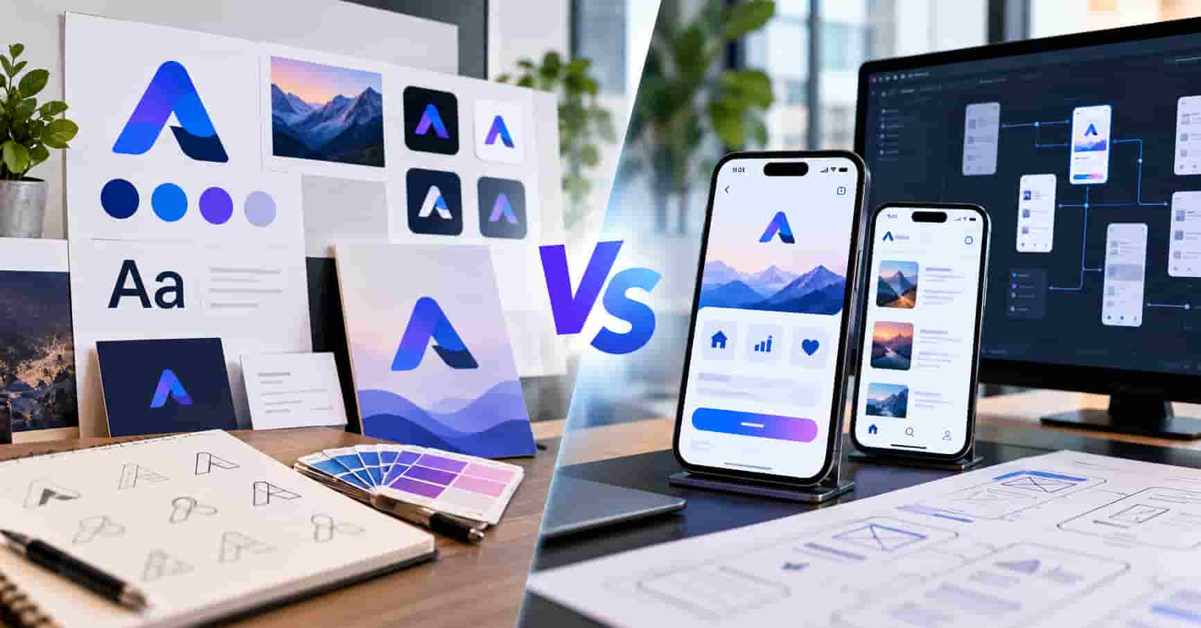
A brand book written for print and billboards meets a sixty pixel icon and a platform with opinions. Something has to give, and it should be decided rather than discovered.
Key takeaways
- Identity work owns recognition; platform specialists own how that recognition behaves under system rules.
- Most brand systems fail on phones at the icon, the dark theme, and the type scale.
- Deliver tokens rather than a PDF, and the two engagements stop arguing.
A company preparing an app launch collects two proposals. One obsesses over branding and identity. The other emerges straight from a dusty workshop, forging raw mobile hardware every single day. The service page sits at.
Both are necessary at some point. Buying them in the wrong order produces a beautiful system that the app cannot apply.
Where brand systems break on a phone
The icon is the first casualty. A wordmark that reads across a poster turns into a smudge at the size a home screen allows.
Typography becomes the second casualty here. Display faces chosen for headlines lose legibility at fourteen points on a moving screen in daylight.
Colour produces a third kind of failure. A palette built for white paper often breaks contrast rules once the system switches to a dark theme.
Motion is the quiet fourth one. Brand animations designed for a launch film feel slow when they sit between a tap and a result.
According to Statista, app market revenue in the United States is projected to reach US$317.39 billion in 2026. (Statista, 2026)
Spending at that level buys a crowded store where recognition matters. It also means every competitor has already solved the icon problem you are about to meet.
What identity work must deliver for a product
Logos fail as app deliverables. Developers desperately require a meticulously drawn icon scaled to precise platform dimensions, then rigorously tested across shifting light and dark modes. That changes everything.
Typography needs a working scale rather than a poster specimen. Sizes, line heights, and a fallback for platform defaults belong in the package.
Colour needs tokens with contrast tested in both themes. Two palettes that pass on paper can fail an accessibility check in an interface.
Store assets belong in that package too. Screenshots, feature graphics, and the listing description carry the brand to people who never open the product.
Ask whether branding and identity design services include those items before signing. Many quotes assume print and web only, and the gap appears at the worst moment.
What the platform specialist owns
Studios fall back on tired habits. Users demand familiar swipes, menus, and system sheets right away. Day one expectations rule the whole show.
Breaking those conventions costs you comprehension. Users forgive an unexpected colour and struggle with an unexpected back button.
Platform work also covers states nobody demos. Offline, permission denied, expired session, and empty views are where phone products actually fail.
Store review is part of the job. Rejections often come from flows rather than from code, and a studio with release history anticipates them.
What each supplier is actually accountable for
Accountability is easier to compare than craft. Identity teams answer for recognition across every surface a company owns.
Platform teams answer for whether people can operate the product without thinking. Those are different jobs measured in different ways.
Branding scopes usually cover names, marks, typography, color, and usage rules. Product surfaces? Those only show up if someone specifically asks for them.
A mobile app design agency answers for flows, states, and platform compliance. Brand decisions arrive as constraints it applies rather than as questions it debates.
Write both accountabilities into the briefs. Most disputes in this pairing come from an unstated assumption about who decides what.
A short test before either contract
Print the proposed icon at the size a phone actually uses and look at it across a room. Recognition at that scale is the whole job.
Set the proposed body text at fourteen points and read a paragraph on a phone outdoors. Display faces fail this test more often than they pass it.
Put the palette on a dark background and check the contrast numbers. Adjustments made now cost minutes rather than a release.
Run the same three checks with both suppliers present. Teams offering branding and identity design services respond well to concrete constraints, and platform teams stop guessing what is negotiable.
Record the results in the brief. A decision written down survives the next round of stakeholder opinions.
Where the two disagree
Brand design chases striking aesthetics, whereas platform engineering demands absolute comfort. That friction hurts, Ignore it, and you ship something sharp that feels completely wrong.
Fix the divide. Let identity claim the launch screen, the icon, empty states, and those fleeting moments when people actually celebrate a win.
Convention should dominate the working screens. Lists, forms, and navigation belong to the platform, with brand expressed in colour and type rather than in structure.
Write that division into the brief. Teams that agree it early stop relitigating every screen review.
Tokens are the contract between them
A brand delivered as a PDF creates work for everyone downstream. Developers extract values by hand, and the system drifts within two releases.
Tokens? They actually skip the translation bit entirely. You define the color, spacing, radius. And font once, and bam: they’re good for the app, the site, and whatever else comes next.
Just have your identity folks generate them in a format your engineers already use. A handover requiring conversion? That just gets stale, real quick.
Oh, and pick a maintainer. Tokens without a clear owner just gather dust instead of evolving.
Common mistakes when these two engagements meet
- Approving a brand system without testing the icon at the smallest size a platform uses.
- Choosing a display typeface before anyone checks how it renders in a dense list.
- Leaving dark theme colours to the build team, who then invent a second palette.
- Booking the app studio before the identity decisions are locked, so screens get redrawn twice.
The last one costs the most calendar time. Layout work against a moving palette repeats itself quietly until somebody notices the budget.
How the app work changes an identity brief
Product surfaces raise questions a print brief never asks. What does the brand look like while something loads, and what does it say when a request fails?
Tone of voice becomes operational here. Error messages, permission prompts, and empty states carry more brand contact than any campaign line.
A mobile app design agency will ask for that language early. Branding and identity design shops usually ship products with this already baked in. But illustration is different. It demands a working system, not just a bunch of hero images, you need exact sizes, specific formats, and clear rules. That keeps the style alive.
Sound and haptics belong in the conversation for some categories. They are part of the brand experience on a phone, and nobody else will own them.
Dark themes and accessibility
Dark mode isn’t just a technical switch. It is a brand issue. Inverted palettes alter how a colour reads, and bright brand tones vibrate against dark backgrounds.
Test both themes with real content. A palette approved on a slide behaves differently behind a list of transactions or messages.
Accessibility checks belong in the same pass. Contrast ratios, focus states, and scalable type sizes all interact with brand decisions.
Budget a round of adjustment after the first build. Screens reveal problems that no static comparison shows.
Gartner says CMOs will throw roughly 15. 3 percent of marketing funds at AI by 2026. When budget crunches hit marketing departments, identity programs take the first hit. Scope those projects tightly around what your specific product actually needs, Forget trying to copy whatever massive category leaders are buying out there.
The store listing is a brand surface
Most people meet the product in a store before they install anything. Icon, first screenshot, and the opening line of the description do the persuading.
Treat those assets as part of the identity scope. Screenshots assembled by an engineer the night before release look exactly like that.
Localise the assets carefully when it matters. Text baked into screenshot images has to be redone for every language you support.
Refresh the listing when the product changes. Outdated screenshots create expectations the app no longer meets.
Our designers work inside the client’s team, which is how brand decisions and interface work stay in the same conversation. On SaaS and FinTech products we define tokens before the first screens. The identity then applies to the app and the web product from one source. Our engineers build against those tokens, which keeps a later refresh from turning into a rewrite of every component. Long partnerships make that discipline pay off, since the second year is when unowned systems usually start drifting.
Keeping both systems aligned after launch
Alignment decays through small decisions rather than big ones. A new screen invents a spacing value, and a campaign adds a colour nobody approved.
Review both surfaces together each quarter. Side-by-side screenshots expose drift faster than any written standard.
Give one person authority over the token set. A mobile app design agency and a marketing team will otherwise resolve conflicts in opposite directions.
Treat your system like code. Version it. Releases pointing straight to a token build make it obvious which rules are running.
Plan one refresh cycle a year at most for structural changes. Web development services and app releases both absorb that rhythm without disruption.
Sequencing the two engagements
Lock down your name, your mark, and the base palette first. Those three choices block everything else out. Backing up costs a fortune. Bring platform specialists in the second that color scheme lands, because early contrast and legibility notes save you from painful redesigns.
Run the icon work with both teams present. Identity owns the concept, and platform experience owns whether it survives at small sizes.
Keep the full brand programme for later if budget is tight. A programme covering merchandise and event signage answers questions this company has not reached.
One honest limitation applies to this sequence. Companies in trust-driven categories sometimes need the complete identity before launch, and that pushes the app work later.
Who reviews what, and when
Review cycles cause more delay than design work in this pairing. Brand approvals sit with founders, and product approvals sit with whoever owns the roadmap.
Separate the two review tracks deliberately. Sending every screen to a brand review turns a two-week sprint into a month.
Agree what triggers a brand review. New surfaces, new illustration, and anything touching the mark belong there, while a form layout does not.
Keep a shared log of approved decisions. Branding companies and product teams both stop relitigating once the record exists.
Set a response time for both sides. Feedback within two working days keeps momentum, and silence for a week costs a sprint.
What to ask for in the handover
Ask for source files with editing rights rather than exported assets. Teams inherit products for years, and locked files age into obstacles.
Ask for the icon at every requested size, plus the reasoning behind the smallest version. That note prevents a redraw when platforms change their guidelines.
Ask for the token file in a format your engineers already consume. Conversion work is the quiet tax on a badly planned handover.
Ask for a short recorded walkthrough. Fifteen minutes of explanation saves hours of interpretation later.
Ask for a named contact for the first month after launch. Questions arrive whichever supplier finished last.
What each engagement costs in practice
Identity pricing scales with applications rather than with hours of drawing. An icon and a small system costs a fraction of a programme covering packaging and campaigns.
App design pricing scales with flows and states. Two platforms mean two sets of conventions, though a shared system reduces the difference.
Both estimates move when research enters the scope. User sessions cost weeks and prevent more expensive mistakes.
Ignore grand totals, Store assets, dark mode, and accessibility testing vanish first when budgets tighten. Absolutely nothing survives the ruthless axe.
Budget sequencing when money is tight
Few companies fund both engagements at full scope before a launch. Deciding what to defer is easier with a rule than with a debate.
Fund anything expensive to reverse first. The name, the mark, and the core palette qualify, and a campaign system does not.
Fund anything users touch daily next. Type scale, colour tokens, and the icon shape every session in the product.
Defer the material that supports scale you have not reached. Event signage, merchandise, and sub-brand rules can wait for evidence.
Revisit the deferred list after two quarters of real usage. By then the product tells you which surfaces matter rather than the plan guessing.
Sorting the other proposals
An app launch attracts quotes from several directions, and the labels overlap more than the work does.
Identity suppliers vary more than any other group. Branding companies range from naming and strategy practices to studios that mainly draw marks. Request the usage rules from a shipped product, since presentations flatter every studio equally.
Research specialists sit apart from both. A UX design agency running discovery suits a product whose shape is still open, while another UX design agency may only test existing flows. Research and interface work arrive together in most contracts for UI UX design services. Comparing two offers for UI UX design services comes down to how much of each half is included.
Marketing suppliers handle the surfaces around the product. That digital agency owns the site. Frankly, their work ends abruptly at the download button. A rigid layout makes these website packages easily comparable, especially when they cost strictly per individual template.
Build suppliers answer questions about delivery. Token storage in the codebase is worth raising with a web development agency, because it prices the next refresh. You might hire one crew just for the marketing page. Another agency keeps full-time engineers on the payroll instead of hiring per gig. And shops that mostly pump out simple brochure sites usually miss just how many hidden states a real product screen actually has. That matters. Put a post-launch data model change to any website development company before signing. A second website development company may quote maintenance as its own line. Web development services for a product with accounts need state handling and analytics events in scope. List every third-party service in the web app development estimate, since each one adds hours nobody predicted. Web development services quoted without environments leave a gap somebody fills later, and a third website development company may decline work outside its stack.
Phone delivery has its own suppliers. A mobile app development company should start by asking which tasks genuinely belong on a phone. Mobile app development services need to cover store submission and the fixes that follow it. Tokens should travel to whichever mobile app development agency joins after the web product. Web app development for the companion browser experience belongs in the same plan, since users move between the two in one session.
Questions that separate the shortlists
Ask the identity candidate to show an icon they designed and the sizes it was tested at. Specific answers arrive from teams who have shipped apps.
Ask the platform candidate which brand rule they pushed back on. A studio that never pushes back will build whatever the PDF says, including the parts that fail.
Ask both who owns the tokens after launch. Silence predicts two design languages inside a year.
Ask for a store listing they produced end to end. Listings show whether a team thinks past the build.
Which one to brief first
Start with identity when the company is new, the name is unsettled, or trust carries the sale. The app work then applies a system rather than inventing one.
Start with the platform studio when the brand exists and the product is the risk. Extend the identity into app-specific assets as part of that engagement.
Whichever comes first, insist on tokens and an owner. Those two artifacts decide whether the second engagement builds on the first or quietly repeats it.
One plan covering both engagements removes the coordination cost that two contracts create. For companies shipping a phone product and a web product together, that arrangement usually costs less than two contracts and a translator.
Your browser does not support embedded video.
Frequently asked questions
Should the app icon be designed by the brand team?
Design it together, with the brand team owning the concept and platform designers testing it at real sizes. Icons approved only on a slide tend to fail on a busy home screen.
Can a brand book replace a design system?
No, because a book describes intent while a system describes behaviour. Ask for tokens and components that engineers can use directly alongside the written rules.
How do we handle brand colours in dark mode?
Define a second set of values rather than inverting the first. Saturated brand tones usually need adjustment to stay readable against dark surfaces.
Who prepares the store screenshots?
Put them in the design scope with a named owner and a refresh schedule. Listings assembled at the last minute undercut the work that went into the product.
What if the platform conventions clash with our brand?
Give structure to the platform and expression to the brand. Familiar navigation with distinctive colour, type, and moments of delight reads as confident rather than as generic.
Do we need both engagements before launch?
You need a minimum of each: a tested icon, a working type scale, and a colour set with dark values. The broader identity programme can follow once the product has users.
How often should the identity be refreshed in the app?
Change structural things rarely and refresh surface details as the brand evolves. With tokens in place, a colour or type update ships in days rather than sprints.

Nishanth Kumar is the Lead SEO Strategist at iTech Manthra. With over a decade of experience in the digital marketing landscape, he specializes in technical SEO, link-building strategies, and search engine algorithms. Nishanth has helped hundreds of businesses scale their organic presence through data-driven marketing and sustainable “white-hat” techniques. He is passionate about decoding Google’s ever-changing updates to help brands stay ahead of the competition.